Gehl People
For Gehl People, while working at Gehl People.
Gehl’s new visual identity is pragmatic and playful. It reflects the company’s full personality and the diversity of people: urban change makers, designers, data and social scientists, and strategists.
Team:
Natalia Garcez, Virginia Lui, Christopher Reeves, Valeria Capatina, Jeff Risom, Festa Isufi, Christine Skovlund
Design deliverables:
Brand Identity // Website
Designed by e-types, the logo is simple yet thoughtful. The curve of the H meets the vertical bar and the weight of the G subtly forms an upward arrow.
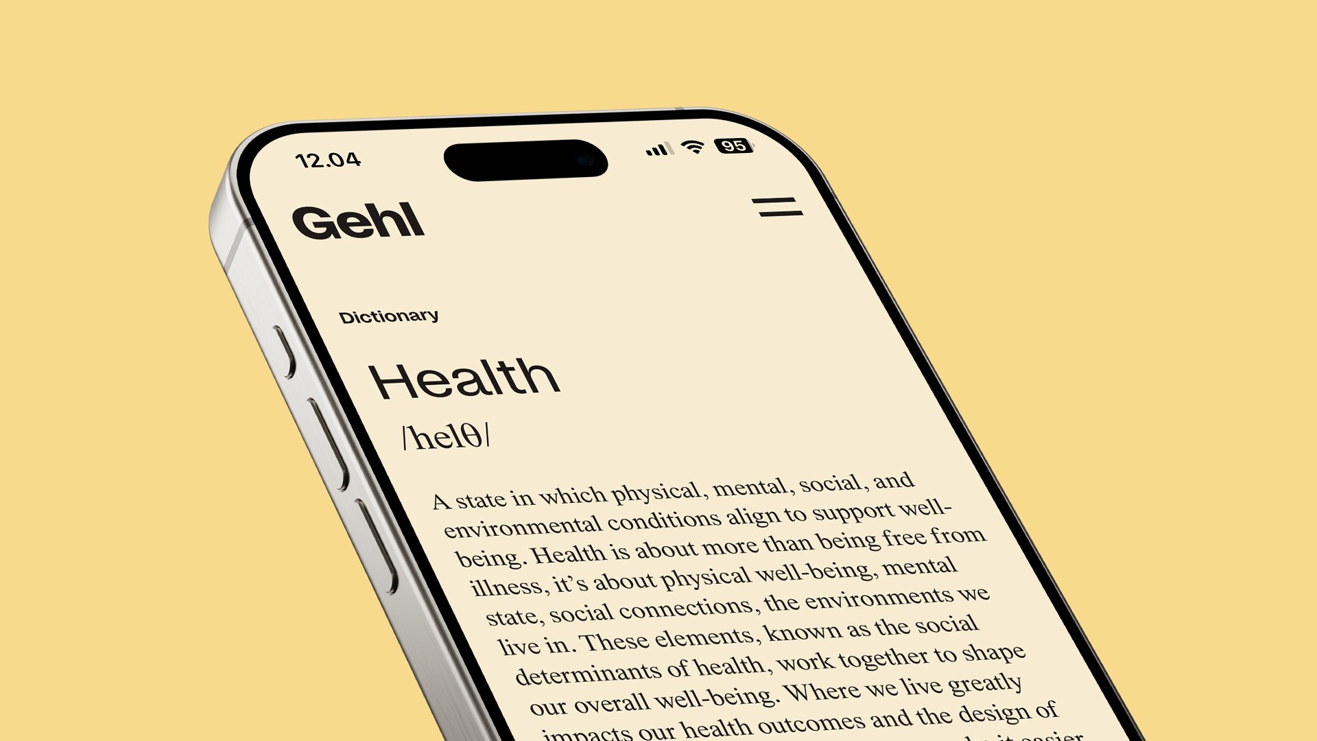
Gehl’s new website is designed with simplicity and clarity in mind.
Ample white space and a clear typography hierarchy is designed to ease navigation.
Thoughtful micro-interactions — like hover effects, a transforming pointer, and dynamic counting numbers — enhance the user experience.
Vivid colors in filters highlight the range of Gehl’s services, while an interactive world map invites our community to explore our full depth and breadth of projects.


Gehl’s color palette celebrates urban spaces: asphalt greys, brick oranges, bike-lane yellows, and canopy greens.
It’s a representation of the people and places we design for.
Our primary colors are white, black, and our legacy blue — simple, collaborative, and ever-adaptive.


